7.9 KiB
- Overview of
dailies-overlayed.pyScript - Design/Trade-Off Notes and Decisions
- Files Used
- Files Produced
- What the Script Does
- Examples/Screenshots
Overview of dailies-overlayed.py Script
I have assumed you have ran ./separator.sh and ./totalilator.sh, created a
virtual-environment (venv) (python3 -m venv venv) and installed the dependencies
(via pip -r install requirements.txt). See the project's README for more
information on setting the repository up.
  cd <PATH TO RITHERDON-CHARTS>
  # Activate the virtual-environment if you haven't...
  source venv/bin/activate

  # Run the script...
  python dailies-overlayed.py
Design/Trade-Off Notes and Decisions
- This script processes the data produced by both Light Meters.
- I did not add a legend to the chart because there are too many lines plotted and it makes the chart difficult to read – legend either takes up too much space or it simply over-runs off the screen.
-
The values on the x-axis do not represent a timestamp. Each reading has an Id. number assigned to it. This is because of the inconsistencies between each day's data. The timestamps between each do not align with each other (messy data) so assigning each reading an Id. number was the easiest solution to get the scripts to run.
- The general pattern of the reading were the priority here, not the accuracy of when the readings were recorded.
- The exhibition ran until the 1^st August 2021 but that was a Sunday and no one, in Ritherdon, worked that day – so there were no reading taken (I.E. no data to process).
Files Used
  # NOTE: I have altered the list below based on the output produced by the
  # following line...
  tree -L 1 ../data/light-meter-*
../data/light-meter-1
├── 2021-06-13.csv
├── 2021-06-14.csv
├── 2021-06-15.csv
├── 2021-06-16.csv
├── 2021-06-17.csv
├── 2021-06-18.csv
├── 2021-06-19.csv
├── 2021-06-20.csv
├── 2021-06-21.csv
├── 2021-06-22.csv
├── 2021-06-23.csv
├── 2021-06-24.csv
├── 2021-06-25.csv
├── 2021-06-26.csv
├── 2021-06-27.csv
├── 2021-06-28.csv
├── 2021-06-29.csv
├── 2021-06-30.csv
├── 2021-07-01.csv
├── 2021-07-02.csv
├── 2021-07-03.csv
├── 2021-07-04.csv
├── 2021-07-05.csv
├── 2021-07-06.csv
├── 2021-07-07.csv
├── 2021-07-08.csv
├── 2021-07-09.csv
├── 2021-07-10.csv
├── 2021-07-11.csv
├── 2021-07-12.csv
├── 2021-07-13.csv
├── 2021-07-14.csv
├── 2021-07-15.csv
├── 2021-07-16.csv
├── 2021-07-17.csv
├── 2021-07-18.csv
├── 2021-07-19.csv
├── 2021-07-20.csv
├── 2021-07-21.csv
├── 2021-07-22.csv
├── 2021-07-23.csv
├── 2021-07-24.csv
├── 2021-07-25.csv
├── 2021-07-26.csv
├── 2021-07-27.csv
├── 2021-07-28.csv
├── 2021-07-29.csv
└── 2021-07-30.csv
../data/light-meter-2
├── 2021-06-13.csv
├── 2021-06-14.csv
├── 2021-06-15.csv
├── 2021-06-16.csv
├── 2021-06-17.csv
├── 2021-06-18.csv
├── 2021-06-19.csv
├── 2021-06-20.csv
├── 2021-06-21.csv
├── 2021-06-22.csv
├── 2021-06-23.csv
├── 2021-06-24.csv
├── 2021-06-25.csv
├── 2021-06-26.csv
├── 2021-06-27.csv
├── 2021-06-28.csv
├── 2021-06-29.csv
├── 2021-06-30.csv
├── 2021-07-01.csv
├── 2021-07-02.csv
├── 2021-07-03.csv
├── 2021-07-04.csv
├── 2021-07-05.csv
├── 2021-07-06.csv
├── 2021-07-07.csv
├── 2021-07-08.csv
├── 2021-07-09.csv
├── 2021-07-10.csv
├── 2021-07-11.csv
├── 2021-07-12.csv
├── 2021-07-13.csv
├── 2021-07-14.csv
├── 2021-07-15.csv
├── 2021-07-16.csv
├── 2021-07-17.csv
├── 2021-07-18.csv
├── 2021-07-19.csv
├── 2021-07-20.csv
├── 2021-07-21.csv
├── 2021-07-22.csv
├── 2021-07-23.csv
├── 2021-07-24.csv
├── 2021-07-25.csv
├── 2021-07-26.csv
├── 2021-07-27.csv
├── 2021-07-28.csv
├── 2021-07-29.csv
└── 2021-07-30.csvFiles Produced
ls ../output/lm*-dailies-overlayed.html../output/lm1-dailies-overlayed.html
../output/lm2-dailies-overlayed.htmlWhat the Script Does
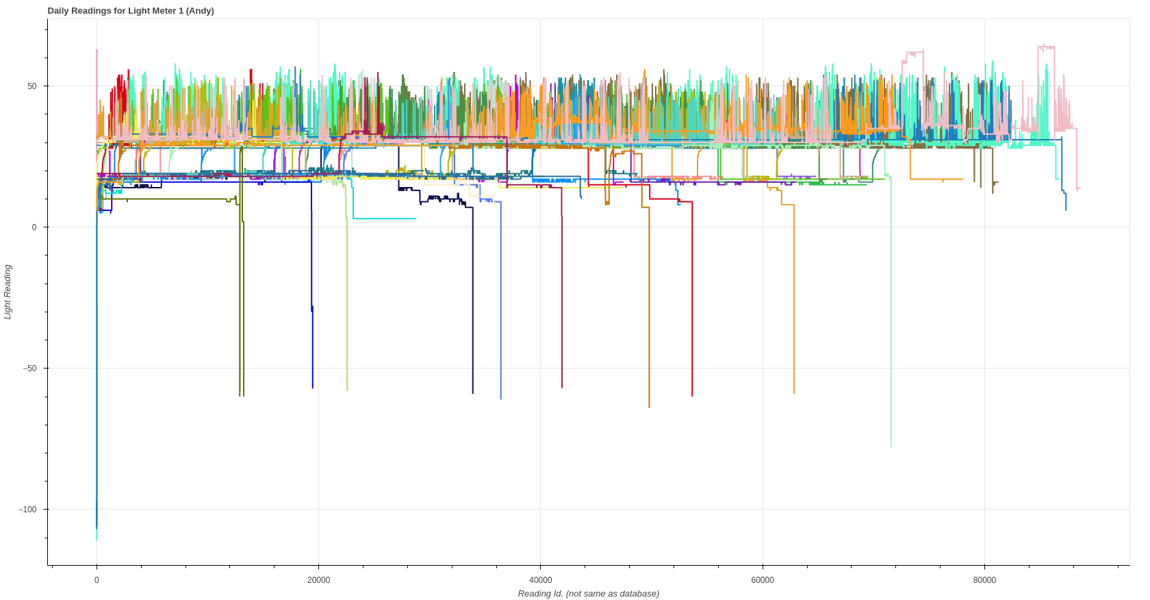
The charts produced by this script are not accurate but useful.
This script produces two charts. It does this by taking all the daily reading
for both Light Meters (the CSV files listed above) and overlays them on top of
each other. Each chart represents the readings from a given Light
Meter. output/lm1-dailies-overlayed.html show all the readings for Light Meter 1
and /output/lm2-dailies-overlayed.html show the readings for Light Meter 2.
Each line on both charts represents all the readings for a given day. The x-axis values do not denote a timestamp, though. What this means is the lines in the charts do not include the time data. They only illustrate the light levels recorded in sequential order – the time is took between each change is missing. This is why these charts look different when compared to the charts of each individual day.
Below is an example of what the data looks like when the script is first
run. The data is from data/light-meter-1/2021-06-19.csv.
| time | reading |
|---|---|
| 2021-06-19 07:03:11.000000 | 13 |
| 2021-06-19 07:03:12.000000 | 13 |
| 2021-06-19 07:03:13.000000 | 13 |
| 2021-06-19 07:03:14.000000 | 13 |
| 2021-06-19 07:03:15.000000 | 13 |
| 2021-06-19 07:03:16.000000 | 13 |
| 2021-06-19 07:03:17.000000 | 13 |
| 2021-06-19 07:03:18.000000 | 13 |
| 2021-06-19 07:03:19.000000 | 13 |
| 2021-06-19 07:03:20.000000 | 13 |
| 2021-06-19 07:03:21.000000 | 13 |
| 2021-06-19 07:03:23.000000 | 13 |
| 2021-06-19 07:03:24.000000 | 13 |
| 2021-06-19 07:03:25.000000 | 13 |
| MORE READINGS HERE… | … |
| 2021-06-19 15:59:47.000000 | 3 |
| 2021-06-19 15:59:49.000000 | 3 |
| 2021-06-19 15:59:52.000000 | 3 |
| 2021-06-19 15:59:54.000000 | 3 |
| 2021-06-19 15:59:57.000000 | 3 |
| 2021-06-19 15:59:59.000000 | 3 |
Because each day has different time values, it makes is difficult to map the
data from each file on to a single x-axis. I decided to take the easy route and
map each time stamp to a sequential number. In other words,
| time | reading |
|---|---|
| 2021-06-19 07:03:11.000000 | 13 |
| 2021-06-19 07:03:12.000000 | 13 |
| 2021-06-19 07:03:13.000000 | 13 |
| MORE READINGS HERE… | … |
becomes,
| time | reading |
|---|---|
| 1 | 13 |
| 2 | 13 |
| 3 | 13 |
| SEQUENCE CONTINUES TO END OF FILE… |
You will see that in the following section of code in the dailies-overlayed.py
script.
  x_raw_vals = []
  y_raw_vals = []
  counter = 0
  for row in file_data :
      x_raw_vals.append(counter) # The timestamp is replace here...
      counter += 1
      y_raw_vals.append(row[1])
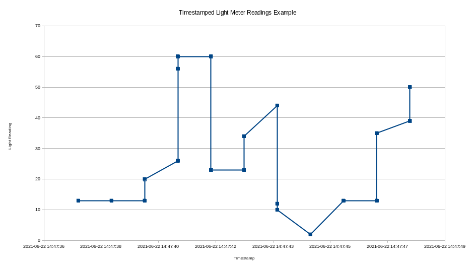
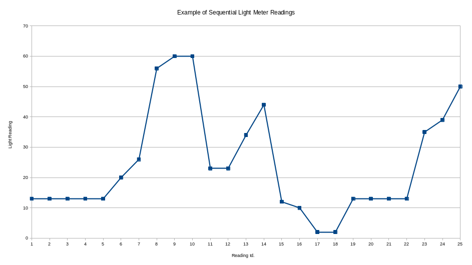
Below is an example of how the charts differ when you remove the timestamped data from the x-axis.


Both charts above have the same y-axis values but the scale of the x-axis is different so the lines appear different. The same general pattern emerges, though, and that is the piece of information we/Nicola/I want in this instance.
I repeat again,
The charts produced by this script are not accurate but useful.
Examples/Screenshots
